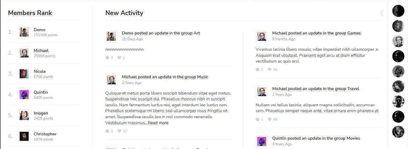
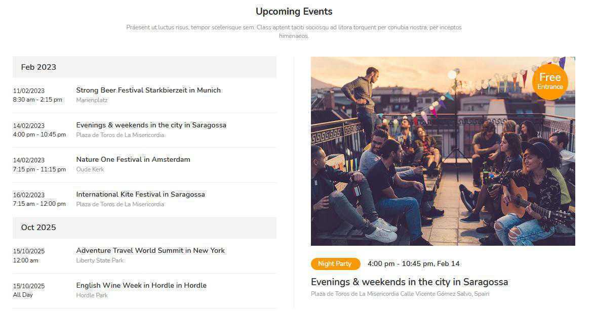
Forum being one of the most popular connecting channel for communities from the professionals in uncountable number of domains. And thus the 1st look and feel of the website, plays an important role as love at first sight. I am here by taking advantage of showing one sample of an ideal website UI. Below are the pointers you may find interesting –
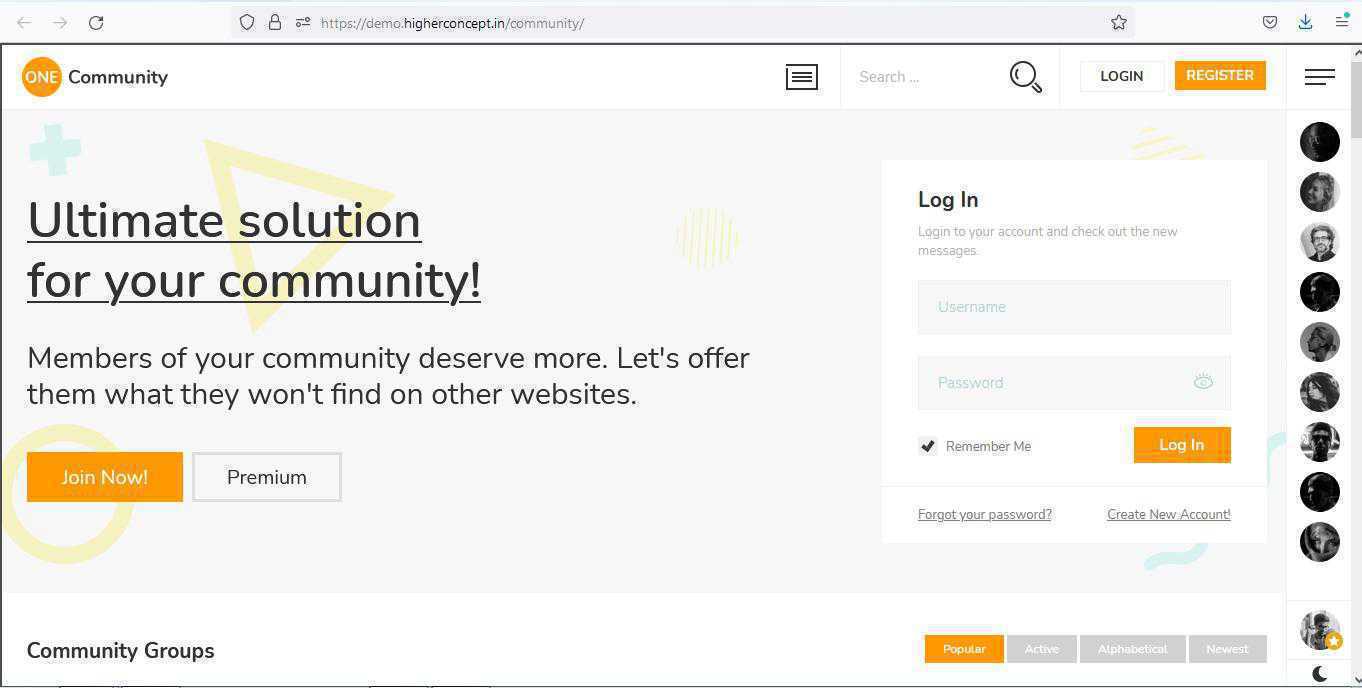 1. Clean and Clear moto of the website on the top banner.
The tag line and the top banner on the website creates an interest in the mind of the viewers within 10 sec on 1st visit. The average time spent on the website may be the secondary parameter, but to make your visitors the viewers is mainly dependent on the first attractive look of the home/landing page. Gather the doctors, hospitals or any other service providers or even the patients together on a single platform, forum is the most easiest way.
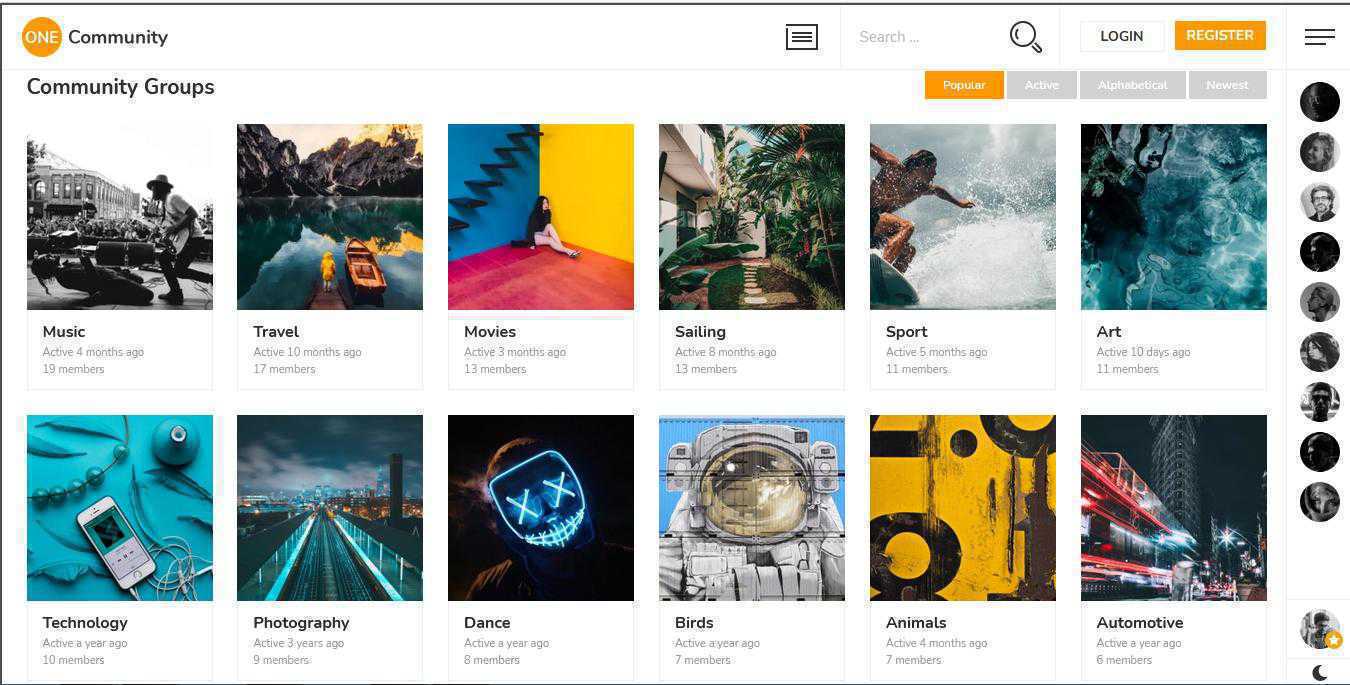 2. Showcase Your Assets.
Organize the content in a presentable format that will be easily readable. The users surfing should not suffer him/her on your website. Collect all the data, plan for nearest future, classify it, use taxonomy for making the search easy and accurate.
Dont forget the users are the most most vital asset, thus make sure that there is enough important place to showcase your users, at least the online ones.

3. Make It Happening.
Keep your users engaged on the website. Events, Activities, Posts, Comments, Blogs, News, Webinars, Interviews or Live Sessions. Find all possibles ways that you can maintain on your website to engage your users and involve them, right from the everyday habits. Active participation will definitely bring more and more traffic towards the website.
People tend to go to the restaurant which has more crowd.
The remaining 7 Secretes are still kept as secretes, and will be disclosed soon. Keep following this topic to not to miss the updates. Your comments will be useful for the improvements.
More Details on http://www.higherconcept.in
Yatin Sawant, Founder, Higher Concept
 1. Clean and Clear moto of the website on the top banner.
  2. Showcase Your Assets.